From Bar Graphs to Instagram Stories
Tracking the Evolution of How Data Visualization Professionals Present Data
DEVELOPED BY MARY ANN AABYE
Monitoring & Evaluation Specialist | U.S. Department of State

Ever wonder what the most popular chart types are? Or how visuals most often get shared? And with whom?
Those are questions I had when looking at the Data Visualization Society's State of the Industry Survey. But I was also curious how things had changed over the last few years. So I dove in, focusing specifically on chart types, content sharing platforms, and audiences over the last four years, to track the evolution of how data visualization professionals present data.
Keep scrolling to explore what I found interesting and see what stands out to you!
chart type
It will probably come as no surprise that bar and line charts are consistently the most popular chart types, but how do others stack up? Below we look at the rankings of 21 chart types over the last four years, with rankings based on the percentage of survey respondents indicating they have created that particular chart type in a given year.
Over the last four years, the three most and least popular chart types have not changed...
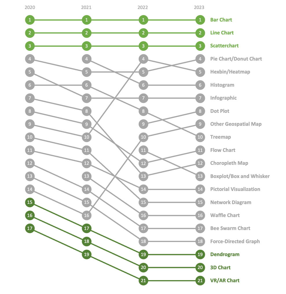
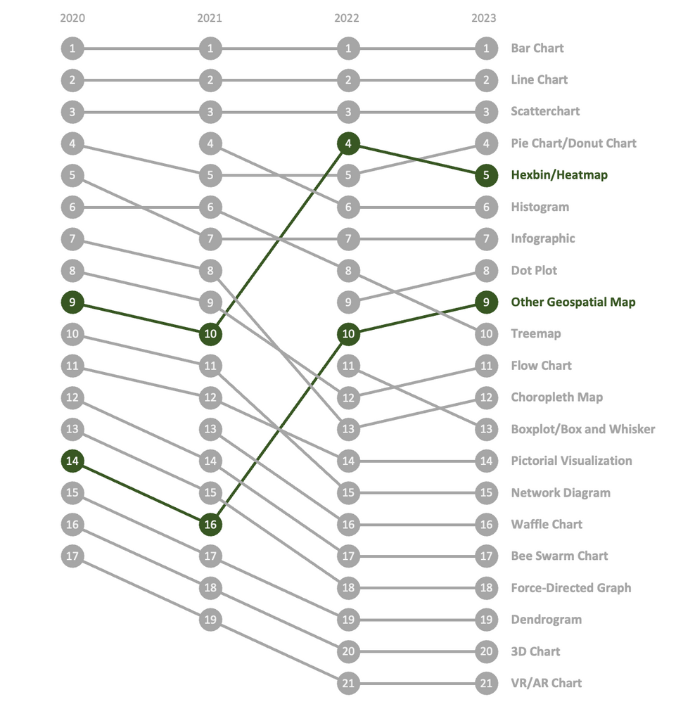
...while all others have experienced some amount of change over that period, with two chart types experiencing significant change in their popularity.
Significant is defined as an overall change of more than five rank placements between 2020 and 2023.
content sharing platforms
We might expect that digital platforms, like web and social media, to become increasingly popular methods of sharing data visualizations. But the data shows a more complicated picture. Below we look at the rankings of 17 content sharing platforms over the last four years, with rankings based on the percentage of survey respondents indicating they use that particular platform in a given year.
Digital platforms have made up the majority of content sharing platforms used over the last four years...
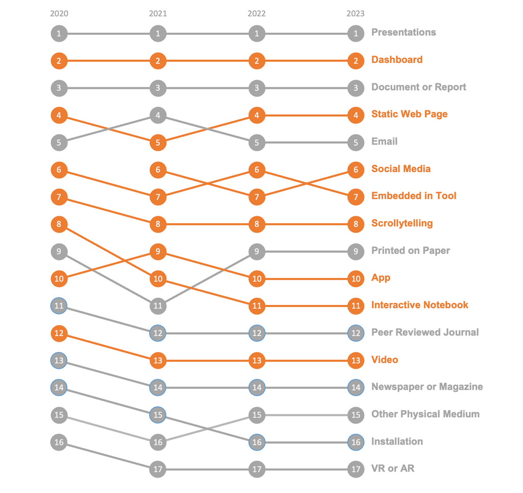
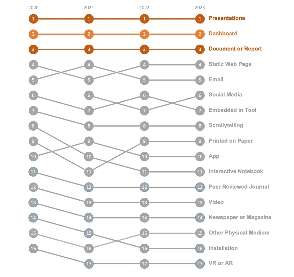
...though more traditional formats find themselves at the top of the list over the majority of digital platforms.
audiences
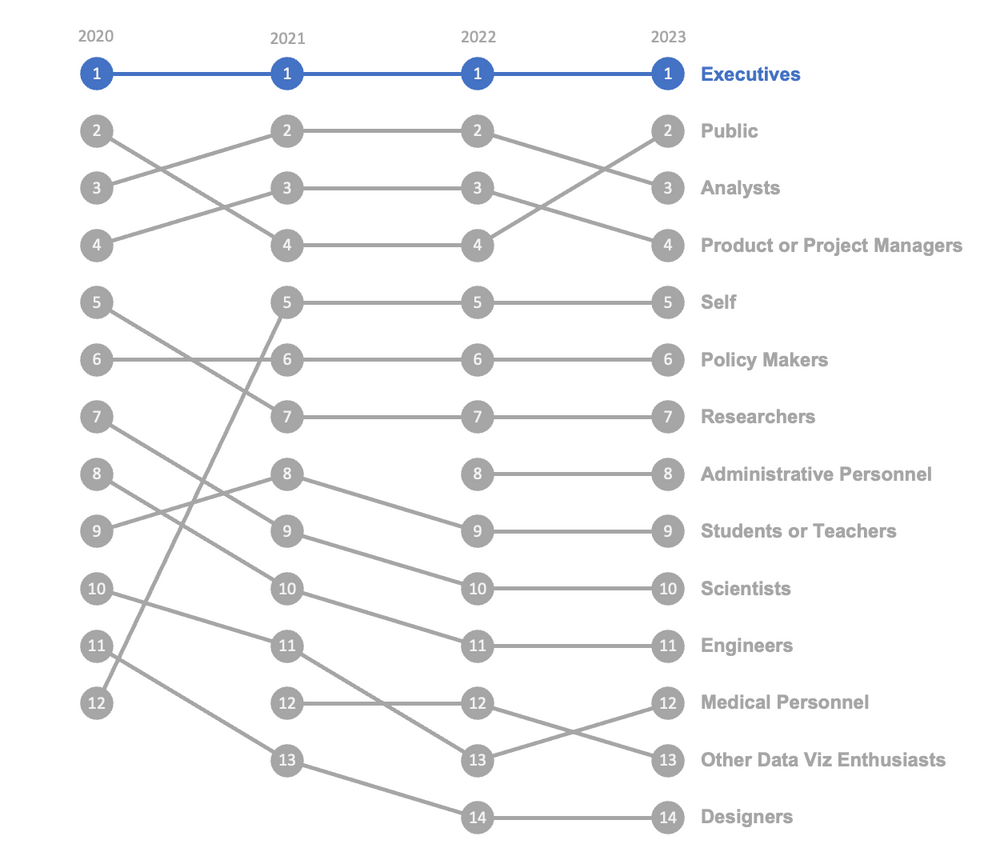
With top decision-makers decisively in the top spot (unsurprisingly), what other audiences are important to data visualization practitioners? Below we look at the rankings of 14 common audiences over the last four years, with rankings based on the percentage of survey respondents indicating they work with that particular audience in a given year.
High-level decision-makers have been the top audience over the last four years...

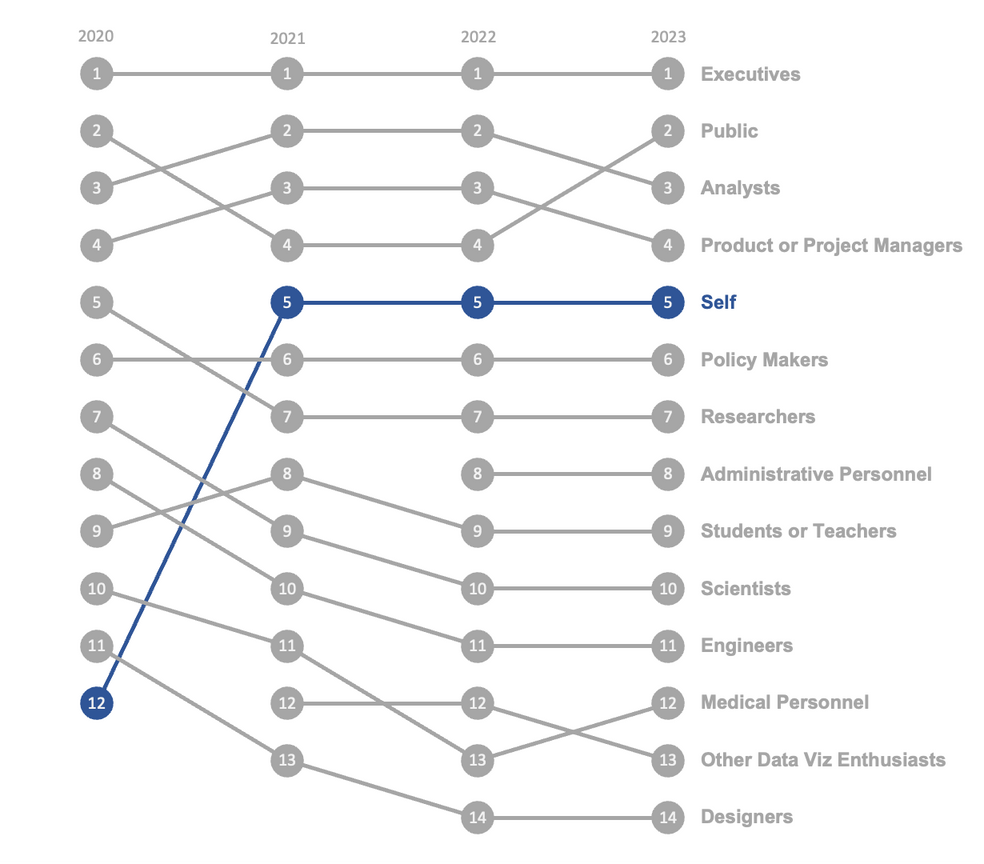
...though we also see a significant increase in practitioners creating work solely for themselves.
Significant is defined as an overall change of more than five rank placements between 2020 and 2023.
what did we learn?
In the dynamic landscape of data visualization, chart preferences endure while digital platforms dominate in an evolution from static graphs to interactive stories and a subtle shift towards personal expression emerges amidst the enduring influence of high-level decision-makers.
You can take a look at my methodology and the data sets I used here. | This work is a submission to the Data Visualization Society’s 2023 State of the Industry Challenge. You can learn more about the challenge here. | Want to get in touch? Find me on LinkedIn.
DISCLAIMER: This work is not affiliated with the U.S. Department of State. Any views expressed are mine and do not represent those of the U.S. Department of State or the U.S. Government.